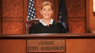
Register   |  Login Free Newsletter Subscription
Subscribe to B&C Magazine
Email
Print
Reprint
Learn RSS

NAB Redesigns Logo, Tag Line

National Association of Broadcasters: ‘Advocacy Education Innovation’

By John Eggerton -- Broadcasting & Cable, 1/7/2008 11:25:00 AM

The National Association of Broadcasters came up with a new logo and tag line -- its first logo revamp in 20 years, the association said.

NAB logo

The logo -- the letters NAB in a less bulky type face than before and preceded by overlapping orange and grey bars -- is meant to "embody our reinvigorated sense of advocacy," president and CEO David Rehr said, as well as an expanding digital presence.

The new tag line is "Advocacy Education Innovation." The NAB will need to do lots of all three.

On the advocacy front, as broadcasters make the switch to digital, they are pushing for help from the Federal Communications Commission in securing cable multicast must-carry, in preventing the use of unlicensed devices in the DTV spectrum and in looking to avoid public-interest-programming quotas in a new reporting-requirement proposal at the commission.

Broadcasters are also working to block the merger of XM Satellite Radio and Sirius Satellite Radio.

Education is a big part of the NAB's charter going forward as it tries to make sure no viewer is surprised by the February 2009 cutoff of analog service.

As for innovation, broadcasters will need to keep finding new, digital ways to deliver their service -- mobile is one growth area -- to be competitive.

The remake was the handiwork of Pittsburgh-based Blattner Brunner, with clients that run the gamut from AARP to Zippo lighters.

Tim Weinheimer, VP, director of account management, at Blattner Brunner in Washington, said the five transparent and overlapping bars in the logo were meant to indicate "motion and activity" and combined both the bands that represent an equalizer "suggesting sound or radio," as well as the blocks of information encoded in digital and high-definition television, symbolizing TV. Grouping and overlapping the different color bars was meant to suggest "community and diversity,:" he said, and to give NAB a "color zone" different from competing organizations.

Email
Print
Reprint
Learn RSS

Talkback

We would love your feedback!

Post a comment

» VIEW ALL TALKBACK THREADS

Related Content

Related Content


By This Author

There are no other articles written by this author.

PRODUCT WIRE


Advertisement

More Content

  • Blogs
  • Podcasts
  • Photos

Blogs

  • BC Beat
    BC Beat

    September 3, 2008
    MSNBC Reins It In
    Congratulations to MSNBC for pulling itself together and looking like a news network again. What a ...
    More
  • Kate Bacon
    Fates & Fortunes

    September 1, 2008
    Working on Labor Day
    14 days from now (if you’re reading this Monday Sept 1…if not, you’ll have to do ...
    More
  • » VIEW ALL BLOGS RSS

Podcasts

Photos

Advertisements


B&C NEWSLETTERS

Click on a title below to learn more.

Broadcasting & Cable Today
B&C HD Update
B&C Telco IP Update
B&C Local Cable Advertising Sales
B&C Hispanic Television Update
B&C International Update
B&C TechTalk
B&C NewsCentral
©2008 Reed Business Information, a division of Reed Elsevier Inc. All rights reserved.
Use of this Web site is subject to its Terms of Use | Privacy Policy
Please visit these other Reed Business sites