'Problematic' FCC Conditions On Station Sale Could Create Detroit Drama
WADL station owner expects transaction to proceed and give the CW an affiliate in the market, while commissioner Brendan Carr says application was ‘denied’ by Media Bureau
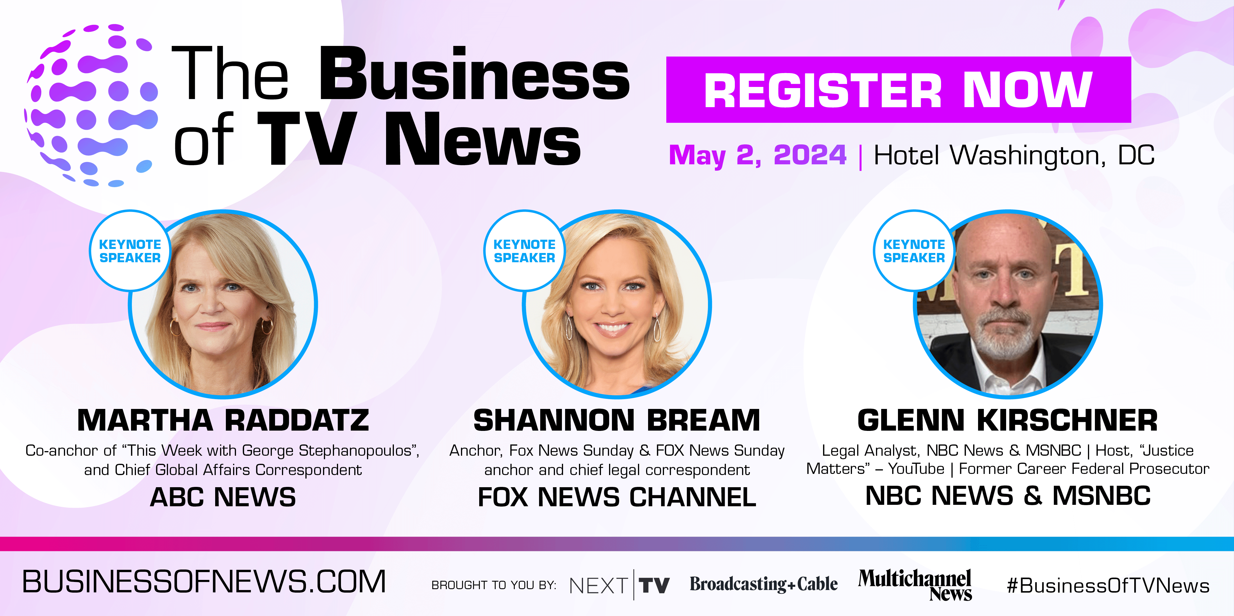
Martha Raddatz, Shannon Bream, Glenn Kirschner set to deliver keynotes

The Fox FAST will gain access to live MMA and women’s soccer

Move comes weeks before upfront

Will remain in leadership role through 2029

20-year Disney veteran, who oversees Disney Plus, Hulu and ESPN Plus, says he’s switching jobs this summer to spend more time with his family
The Fox FAST will gain access to live MMA and women’s soccer
20-year Disney veteran, who oversees Disney Plus, Hulu and ESPN Plus, says he’s switching jobs this summer to spend more time with his family

Fans can follow for free as teams select players

For its next national TV rights deal, the NBA will have at least three broadcast partners, possibly four
20-year Disney veteran, who oversees Disney Plus, Hulu and ESPN Plus, says he’s switching jobs this summer to spend more time with his family

Deployment of BYOD scheme will begin with 60 North America IHS Hotel & Resort locations, allows guests to port their own streaming services from their iPhone or iPad to their room's native LG smart TV

Awards are judged on innovation, feature set, cost efficiency and performance in serving the media & entertainment companies

France’s erstwhile Technicolor bought CommScope’s pay TV set-top and gateway business last year